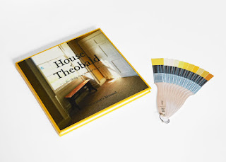
The ‘House of Theobald’ Decorator’s Manual provides consumers/amateur interior decorators with the information, knowledge and advice on how to maximise the potential of their interior spaces within period homes.
The manual sheds light on all that one should consider when planning to decorate an interior space, including architecture, light and style, colour, schemes, sampling, feature walls, period features, Eras of decoration and how to achieve the best finish when decorating.
The hard-back cover, which picks out the bright hue of yellow featured on the cover image, uses G . F Smith Colorplan Citrine for visual cohesion. This bold use of colour also supports the context of the new paint brand, its name and aim.
Using the brand’s primary typeface, Tribute OT Roman, and secondary typeface, Shelby, throughout ensured cohesion and consistency across all outputs, including the identity and paint brush swatches. Wide inside and outside margins within the manual lets content breathe, important in representation of how the decisions you make
as a designer, interior or otherwise, can affect
perception of space.
Used in conjunction with the brand’s swatches, the manual aids the consumers’ ability to choose colours, devise schemes and match to other interior design considerations with ease and confidence, through considered and functional points
of delivery.
Photographic content featured within the manual of Georgian property Swinhope Hall illustrate to readers examples of the content within the book, and potential uses of colour that could be implemented within their own homes to achieve period style.
Photographa


No comments:
Post a Comment