Friday, April 29, 2016

OUGD406: End of Module Evaluation

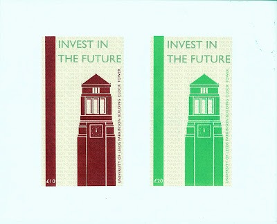
OUGD406, Design Practice introduced 4 briefs over the longest module of the course thus far. This stream of briefs began with Secret 7, the first live competitive brief I have ever participated in. This was followed by the production of our own visual bank note proposal in ‘License to Print Money’ which will go on to be exhibited next month. Interconnected with the money brief was the ‘Exhibition branding’ collaborative brief, before finishing with ‘Speaking from Experience.’ 
Each of the briefs have faced me with a different obstacle to overcome, be that my design style being put under scrutiny, the pressure I have put on myself throughout the module to do well or purely the work load.

Through Secret 7 I feel I was forced to tackle my obvious approach to design head on to try and produce pieces with greater ambiguity, which I feel I was able to achieve. This was probably the first brief where I really explored a range of significantly distinct concepts and ideas, however have since been able to continue this approach in application to the other studio briefs.

License to Print money was by far my favourite brief within the module, as the considerations on the current state of finance and methods of transaction in regard to people within the society intrigued me and led me to produce a bank note that had the considerations of future generations at the forefront of its motives.

I found the collaborative brief difficult through out down to my social un-ease and in ability to confront people even when it is what is required. Though I am not unhappy with the work we produced, and am pleased that it was the research that I had gathered that informed the concept we explored, I feel it is ultimately the idea that was deemed inappropriate for the exhibition. 

My delusions regarding time and my ability to achieve within its constraints is something that has not only hindered me in this module but them all throughout the year I feel as I put so much pressure on myself to do well that it often results in me becoming demotivated and complacent about my practice, which I must face urgently before second year. 

I attempted to combat this via the last brief for which I produced motivational cards concerned with time and how to use it as a student, advice I will have to take note of myself immediately in preparation for the further two years of the course.


Wednesday, April 27, 2016

OUGD406 - Speaking From Experience: Final Resolutions (with critique)


In response to OUGD406, Studio Brief 04 - 'Speaking from Experience' and the self initiated brief developed as a result, I produced a series of 5 A6 typographic motivational cards about time and its qualities in an attempt to inspire students to use it wisely. The cards have the potential to be used as decorative devices within student halls to make rooms more personal, combatting the often plain and lifeless aesthetic of these spaces.

The quotes that feature on each of the 5 cards include 'Time is golden,' 'Time is precious,' 'There is no time like the present,' 'There is no time to waste' and 'Make time for yourself.' These quotes both relevantly and appropriately address the relationship and outlook students should have with time in order to enjoy and succeed in student/university life with balance between academia and socialising.  Potential for students to collect each of them is also provided.

Typographic information on the cards is communicated via two distinct type styles. The first, Univers optically kerned, all-caps and set at a point size of 20, provides a strong, bold typeface with clear prominence, distinction and authority. The typestyle successfully delivers an aesthetic of urgency - a considered decision in the deliverance of the notion of time and how it is used as vitally important.
The second is hand-drawn, written in Adobe illustrator using a creative pen and tablet for true-to-form lettering with fluency and authenticity of craft, which complimentarily contrasts with the first style. This type supplies the cards with a hand-crafted, personal and decorative aesthetic via which evident craftsmanship and instilled effort combats the 'throw-away' insignificance typically associated with the leaflets, flyers and posters that are handed to students during the preliminary weeks at university in such an abundance that they are overlooked and disregarded. 

The second, elaborate typestyle and its attempts to create outcomes with greater sentiment are enhance via gold foiling that additionally aid the visual communication of the importance of time through the established connotations of gold and its associated perceptions.

The dynamic between each typographic style is made more apparent via the alternation in tonal/light value impacted by the combination of black and gold on white ground. The visual hierarchy and ordering of the perception of information is somewhat complex in that the black, digitally typed typographic information - though smaller - attracts the gaze first due to the tonal contrast and energy created as a result of the white ground it is set on, as well as due to the bold and dominating characters supplied from the Univers all-caps typeface. The gold typographic information is viewed secondary, enabling the quotes to be read in order and therefore understood with ease. 
All typographic information is confined to a 300gsm A6 card  - set with half-an-inch margins to ensure even spacing around the edge of each card. The handwritten typographic information meets the margin boundaries for compositional wholeness, whilst the typed Univers information is optically kerned, set at a point size of 20 and aligned for purposes of visual balance, clarity aesthetic harmony.

The A6 size of each individual card is small enough to not become an inconvenience to students, yet large enough to not go un-noticed and appear insignificant whilst maintaining importance. The size also enabled me to print multiple cards, 4, at once before cutting equally to size - making the production of them time and cost effective as no paper is wasted. Cards of this size are typical of such prints that students use to decorate their university accommodation walls and interiors as numerous copies/variations can be compositionally arranged together on an expanse of wall or pin-board. 

Whilst also considering how these cards have the potential to motivate and inspire next year's level 04 students, they also address some of my own personal anxieties regarding time and therefore will also be put to use by myself as a reminder of time and how precious it truly is concerned with both educational and personal environments.


OUGD406 - Speaking From Experience: Gold Foiling

Foiling is the process by which a metallic finish is applied to a solid surface via the reaction between gold foil and printed toner-pigment when introduced to a source of heat.

I will be using the following process to foil the time motivational quote cards. Via the addition of this evident craftsmanship and luxury, I hope to be able combat the 'throw-away' insignificance typically associated with the leaflets, flyers and posters that are handed to students during the preliminary few weeks at university in such an abundance that they are overlooked and disregarded. An anticipate the foiling will also enhance the visual communication of the important elf time through the established connotations of gold and its associated perceptions.

Equipment:

• 300gsm smooth white paper.
• Black A4 laser-printed design.
• Gold heat transfer toner foil.
• 2 sheets of plain A4 paper.
• Laminator.
• Scissors.


Step One

Start by sourcing the visual you wish to foil. It should be a solid black shape, silhouette or line. Once selected, scale to your desired size on an A4 sheet of paper before printing. The design must be laser printed for the foil transfer to be successful.

Step Two

With your design printed, you may now choose to cut down your paper if required. Following this, place your design facing upwards on to another sheet of A4 paper.

Step Three

Cut out a piece of foil large enough to entirely cover the black information you have printed. Place it metallic-side up on top of your design.

Step Four

Ensuring not to move the gold foil underneath, another piece of plain A4 paper should be carefully laid on top - sandwiching the design and foil between this and the bottom sheet of paper.

Step Five

The layers of paper should now be fed through a pre-heated laminator. Here, the foil will be transferred via heat on to the black laser-printed information. Repeat this step to ensure maximum
coverage is achieved.

Step Six

Wait a short period of time for the papers to cool before delicately peeling away the gold foil...and voila! You should now have your very own D.I.Y gold-foiled design. 


By following the above process, I have been able to provide a finish to the motivational cards that will given them an aesthetic to be admired and therefore kept by students as apposed to being thrown away along with the standard pieces of student material given out. 

Before:


After:


Tuesday, April 26, 2016

OUGD406 - Speaking From Experience: Documents for Print

Having previously considered the size/shape/format of the motivational quotes cards, I was able to easily produce the document for print. By producing the cards at a scale of A6, I am able to print multiple cards, 4, at once before cutting equally to size - making the production of them time and cost effective as no paper is wasted. This makes the size of each individual card small enough to not become an inconvenience to students, yet large enough to not go un-noticed and appear insignificant whilst maintaining importance.

In order for the next step in the design process to be a success (the gold foiling) the documents being printed must be laser printed as for the foil to transfer to the toner pigment via heat from a laminator. The prepared prints are evidenced below:


Monday, April 25, 2016

OUGD406 - Speaking From Experience: Gold Mock-Ups

In order to ensure my ambitions to gold foil the statement words of the motivational quote cards, I produced the following digitally-rendered gold foil resolutions. This enabled me to identify the dynamic between each typographic style and how the alternation in tonal/light value has impacted the visual hierarchy and ordering of the perception of information.

Despite the black, digitally typed typographic information being smaller than the elaborate gold handwritten type - the gaze is drawn to the black information first due to the tonal contrast and energy created as a result of the white ground it is set on, as well as due to the bold and dominating characters supplied from the Univers all-caps typeface. This enables the quote to be read in order and therefore understood with ease. 

With the mock-ups confirming all is well, I am now able to consider the physical printing of the cards. Mock ups are evidenced below:


OUGD406 - Speaking From Experience: Digital Typography

In contrast with the hand-crafted, personal and decorative aesthetic of the quote card's hand-drawn type, and in attempt to create a more balanced gender-appeal, my next aim was to identify a strong, bold typeface with clear prominence and distinction.


Univers, set in all-caps, is a typeface that successfully achieves the desired contrast through a strong, even-weighted stroke that appears distinct, authoritative and communicates a sense urgency - both relevant and appropriate in the deliverance of the notion of time and how it is used as vitally important.


Univers, set in all-caps.

With Univers selected as the contrasting typeface, I supplied all typographic information to an A6 canvas - set with half-an-inch margins to ensure even spacing around the edge of each card to be produced. The handwritten typographic information meets the margin boundaries for compositional wholeness, whilst the typed Univers information is optically kerned and set at a point size of 20. Once alignment of information for purposes of visual balance and clarity had been arranged, all content was centred for aesthetic harmony.


Using the set margins and lines as a guide, I then created each card's compositional arrangement in preparation for print. These are evidenced below:


Sunday, April 24, 2016

OUGD406 - Speaking From Experience: Hand Drawn Typography

In attempt to create cards with a hand-crafted, personal and decorative aesthetic, I will be supplying each card with a hand-drawn statement word from quotes relating to time's qualities and characteristics. Via the addition of this evident craftsmanship and instilled effort, I hope to combat the 'throw-away' insignificance typically associated with the leaflets, flyers and posters that are handed to students during the preliminary few weeks at university in such an abundance that they are overlooked and disregarded. 

Through critique and consideration of my own I have been able to devise 5 quotes that will allow me to produce a set of 5 quote cards, each different and therefore providing variation and potential for students to collect each of them. I produced each hand-drawn word in Adobe illustrator, using a creative pen and tablet for true-to-form lettering with fluency and authenticity of craft. The quotes and hand-drawn statement word are detailed below:


'Time is golden'


'Time is precious'


'There is no time like the present'


'There is no time to waste'


'Make time for yourself'


Friday, April 22, 2016

OUGD406 - Speaking From Experience: Scale, Shape and Size.

In the previous critique I was prompted to consider the shape and size of the time-motivational quote cards. As large quantities of these cards would need to be produced for distribution to students of the college, the most cost, time and practically effective format needs to be identified. 

The size of each individual card must be small enough to not become an inconvenience to students, yet large enough to not go un-noticed and appear insignificant whilst maintaining importance.

By producing the cards at a scale of A6, 14.8x10.5cm (1 quarter of an A4 sheet), a size akin to standard post cards can be achieved. Cards of this size are typical of such prints that students use to decorate their university accommodation walls and interiors as numerous copies/variations can be compositionally arranged together on an expanse of wall or pin-board. This size is also able to be repeated 4 times within the boundaries of an A4 sheet, meaning multiple cards can be printed at once before being cut equally to size - making the production of them time and cost efficient as no paper is wasted.


OUGD406 - Speaking From Experience: Rationale Critique

Rationale

A series of simple motivational quote-cards about time, its qualities and uses to inspire students to use it and act as a visual reminder of its importance to them as students starting a new journey and level of academia. Contrasting type styles for a distinct design that balances gender appeal, with gold-foiled hand-drawn type to aid visual perception and representation of how precious time is. Quotes could include 'Time is golden,' 'Make time' and 'The time is now.' These cards could be used to decorate student halls and make rooms more personal, which most students like to do to combat the often plain and lifeless aesthetic.

Critique

Please provide any relevant quotes concerned with time that you feel would resonate with first year university students:

  • 'Make time for yourself.' Highlights the importance of a work/social balance.
  • 'The time you enjoy wasting is not wasted time.'
  • 'All we have to do is to decide what to go with the time that is given to us.'
  • 'Time is running out.'
  • 'Make the time.'
  • 'Time is education.'
Additional Comments:
  • Try to make this simple - don't cover to many aspects. Consider the aspects you encountered and maybe focus on something you feel is most important OR this may complicate your approach and deliverable.
  • Really good concept. Consider production.
  • Nice idea. Think about the size.
  • Postcard size would be nice to produce as students could/would place them on their walls.
  • Getting students to think about time is good for the first year.
  • How will these be produced? Handwritten would be nice but time restrictive.
  • Would look lovely and precious in script type and gold foil.
  • Think about scale and size.
  • You really need to consider use of colour to present the 'importance' you stated in the rationale.

Wednesday, April 20, 2016

OUGD406 - License to Print Money: Screen Printed Final Resolutions

Colours may vary from physical print. 

Today I was able to complete my final Future of Money bank note proposal following the digital mock ups and screen print positives thereafter. Via the process of screen print I was able to achieve more vibrant colours and gold typographic information that I would not have been able to replicate digitally and therefore have an enhanced finish. I believe I successfully managed to print the bank notes within the required paper size and format without need to cut out the bank notes as a result of the centred composition and clean edges I achieved.

The bank note designs I feel reflect a real potential for the future of the bank note due to the strategic under tones of the design that work towards boosting the economy through what can only be described as a positive - getting more young adults to come to university to invest in themselves and their future.

OUGD406 - Speaking From Experience: Idea Generation and Concept Manifestos

Through a retrospective analysis of my experience thus far on the course, and identifying that poor time management and the unrealistic expectations I have of my self ultimately being my greatest downfall, I was able to construct a brief that directs me to produce a graphic response that promotes the importance of time and the relationship students must have with it in order to make their first year of study at university as manageable as possible. I must now explore ways in which I may visually communicate this to allow me to address these issues to provide advice for next year's level 04 students.

Concept One - Typographic Clock Face


A typographic clock with quotes in place of hands about time on the face illustrating its cyclical nature through a literal visual representation. This could be made interactive and has potential to be supplied with differentiating information. 


Concept Two - 'Make Time Your Best-friend'


Light-hearted illustrative line drawings that personify a clock to demonstrate a physical relationship with time. Images show a figure and clock-character engaging in activities together typically considered as friend activities, promoting that students must form a strong relationship with time and how they use it in order to achieve set goals, briefs and aspirations. Activities include being on swings, flying kites, playing football and holding hands.


Concept Three - Motivational Cards


Motivational cards about time and its qualities used to inspire students to use it and act as a visual reminder of its importance to them as students starting a new journey and level of academia. Contrasting type styles for a distinct design that balances gender appeal, with gold-foiled hand-drawn type to aid visual perception and representation of how precious time is. Quotes could include 'Time is golden,' 'Make time' and 'The time is now.' These cards could be used to decorate student halls and make rooms more personal, which most students like to do to combat the often plain and lifeless aesthetic. 

Concept three evidences the best use of process whilst also involving the hand-crafted practices I wish to specialise in going into the second year of the course and I will therefore take it to critique. 

OUGD406 - Speaking From Experience: Self Initiated Brief

Brief Deadline: Friday 29th April 2016

Brief: 

Produce a graphic response that promotes the importance of time and the relationship students must have with it in order to make their first year of study at university as manageable as possible. You must find a way to visually communicated time as a vitally important aspect of student life.

Background / Considerations:

Consider the position in which students are in when coming to university for the first time. They are most typically away from home, in student halls/accommodation and are faced with a new level of academia to come to terms with. Think about ways to motivate and inspire students during this time. Students are inundated with flyers, leaflets and handouts upon arrival to university and therefore there is a tendency for these to be deemed as 'throw-away' material - how to overcome this via an element(s) of the design that should be considered.

Mandatory Requirements:

Produce an outcome / resolutions that can be distributed to a large number of students, considering appropriate scale and format that will allow for the work(s) to be integrated into their occupation and lifestyle as students.

Point of Delivery:

You must consider where outcomes may go, the spaces they may be set in and why.

Deliverables:

Final Resolutions.
Rationale and Evaluation.
Design Boards.
Evidencing via relevant blog with labelling.


Wednesday, April 13, 2016

OUGD406 - Speaking From Experience: Reflection of First Year Student Experience

Having almost reached the end of the first year of my degree at LCA, I can certainly say it has not been what I expected or anticipated it to be. Having moved away from home the year previously to complete my Foundation Diploma in Art and Design at the Vernon Street site of the college, I thought that I would be starting my degree with a greater knowledge of what to expect regarding how work is undertaken and the format in which it is submitted at the college. How wrong I was.

From the very outset of the course it became apparent just how intensive the course was going to be. Although I was under no illusions that the course was going to be easy (as after all the course is a competitive one to get on which I was fortunate enough to achieve as it was really my only desire to attend here - no where else), I was not expectant of such a work load. I am no stranger to working on multiple briefs or having heavy work loads, nor am I a student that would ever be satisfied to have not tried my absolute best, however this was a whole new level of work previously unbeknownst to me, exacerbated by my delusion that I was prepared for the course.

The new level of required work is something that I have struggled with throughout the year due to the pressure I put on myself to achieve the absolute best in all briefs, which has been difficult to achieve due to the sheer amount required simultaneously for different modules. I feel I struggle to mentally focus on multiple things at once, with a tendency to prioritise what I deem most important at the time - though this has ultimately resulted in me not evidencing my greatest abilities in all modules and therefore ridiculing myself which has led to demotivation at times. Being a perfectionist makes life very difficult at times due to the expectations I have of myself and what I think am able to achieve - more often than not I find my aims have been unrealistic.

Poor time management and the unrealistic expectations I have of my self have ultimately been my greatest downfall during the first year. Time goes so very fast and it only takes a few days of poor productivity to majorly impact scheduling and the ability to keep up with work once fallen behind with new work being set everyday.

In addition to the pressures I have experienced from the academic side of the course, I also struggled with the social aspect of the course also for the majority of the first year - having only recently settling within a group of friends. After experiencing life in a shared flat during my foundation, I knew it was not something I was able to go through again due to the way I live my life - being very clean and very tidy. This meant when booking my accommodation for university I decided to go into a studio flat, with my own room, kitchen and living area. Though I know this was the right thing to do, I believe it may have contributed to my feelings of social anxiety and isolation as making friends and meeting new people was harder for me to accomplish.

During both my foundation and first year of my degree, my experiences as a student have been somewhat typical, learning to budget and live without the constant in-person support of family. Also, I identify how the first few weeks of a course are concerned with the spreading of information, receiving perhaps hundreds of flyers, leaflets and posters concerned with student events and being given free promotional material - most of which ends up in the bin due to the sheer amount and dis-useful purpose.

Monday, April 11, 2016

OUGD406 - Speaking From Experience: Brief Information and Interpretation

OUGD406 - Studio Brief 04, 'Speaking from Experience,' requires the production of a graphic response, product or piece of work that makes a statement, comment, observation or gives advice about the experience of the first year of this course. Resolutions to be produced are to use any appropriate media or format to develop and identify the content and make entertaining, advisory or informative outcomes.

The design process undertaken should be informed by considerations regarding the new experiences that I have had, the difficulties that I have overcome and the new people I have met and the life skills I have acquired this year. Ultimately, the pieces produced should supply next year's level 04 students with some advice or direction to aid their transition into the student experience, particularly this course, easier.

The hardest element of this brief I believe will be my ability to think about what information I regard as of the most vital importance due to the plethora of new knowledge I have learnt this year. This, as well as attempting to think of these things detached from any negativity I have experienced due to faults of my own, will largely inform the work I produce in response to the brief. 

Saturday, April 2, 2016

OUGD406 - License to Print Money: Screen Print Positives Separations

Having previously addressed my aim/desire to produce my bank note screen print positive separations in preparation for screen printing, below are each required layer for the process identified and in order of how they will need to be printed. I considered the size and format of the exhibition resolution requirement (210x260mm) before constructing the positives as to provide myself with frames that would assist my ability to produce compositionally central prints that met the brief requirements without having the cut around the notes.


Layer 1 - Solid Pale Beige 


Solid, block pale beige colour for both rectangles. 


Layer 2 - Typographic Self-Pattern


Slight variation in tonal value from the light beige of layer 1 as to produce a subtle self pattern of the notes' value in words.


Layer 3 - Red and Green Illustration, Stripe and Vertical Caption.

 Left note design to be printed INDIVIDUALLY red first. Wash off screen, leave to dry and then INDIVIDUALLY print green note.


Layer 4 - Gold Typographic Information.


'Invest in the Future' to be printed simultaneously across both notes in gold.